Hair Loss Marketing, Inc.
Brand Designer, Efferent Media / Vitality MMG
2024
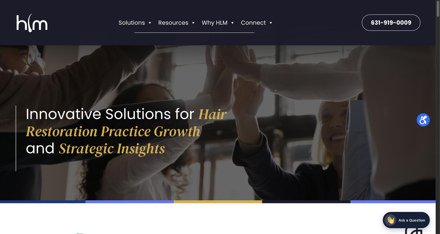
Hair Loss Marketing needed to look like the confident, in-the-know partner it is to hair restoration practice owners — a B2B marketing agency, not a consumer hair-loss clinic — without borrowing the clinical, sterile look the rest of that industry defaults to.
Designed the HLM mark — the initials for Hair Loss Marketing, with the L drawn as a stylized hair follicle — a meaningful, recognizable detail for an audience of hair restoration doctors. Built the full system around it: an authoritative Ink Navy, a warm Signal Gold for emphasis, and an energetic Periwinkle blue as the counterpoint, carried across the site, sales decks, and printed flash cards.
The full identity: a locked color palette, a two-typeface system built around one emphasis move, logo usage rules, pill-shaped UI, and a voice built to speak directly to a practice owner.

Reversed white on Ink Navy — the default treatment across the header and footer.

Solid Ink Navy on white or light card backgrounds.
The L is a hair follicle
A quiet, on-the-nose detail for an audience of hair restoration doctors — the L in HLM is drawn as a stylized follicle, tying the mark directly to the industry it serves.
Don't recolor the mark
The HLM logotype runs flat white or Ink Navy only — never Gold or Periwinkle, and never on top of busy photography without a solid panel behind it.
Fully-rounded pill buttons throughout — outlined on Navy or photography, solid Ink Navy on white. No soft-rounded rectangles anywhere in the system.
Voice & Tone"The Scam Costing Practices Dearly."Blog headline — confident, unafraid of naming what's actually going wrong in the industry
"After working with three disappointing agencies, we partnered with HLM. We've doubled our consult and booking calendars compared to last year."Dr. Reese, MN — client testimonial, signed with name and state for credibility