Mollura Medical Hair Restoration
Graphic Designer, Efferent Media / Vitality MMG
2026 (In Progress)
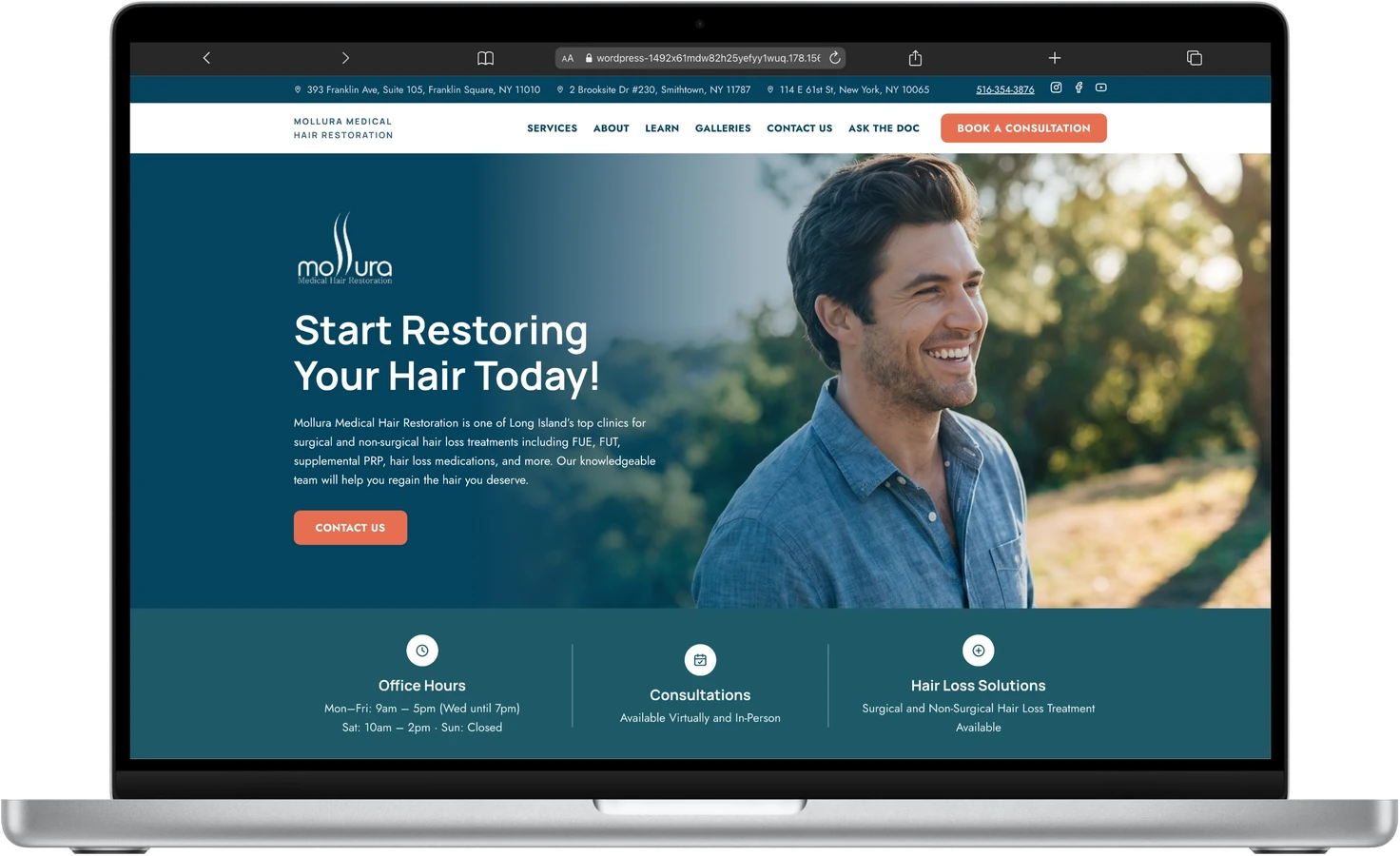
The original site had grown into a single-location brochure page as the practice expanded to three locations. It needed a redesign that could carry a bigger footprint and modernize a dated illustration-led look.
Real patient photography replaced the old illustrations, a warmer navy-and-coral palette gave the brand more warmth, and a V2 brand system (new typography, new accent color, new logo rules) was documented to keep the build consistent from page to page.
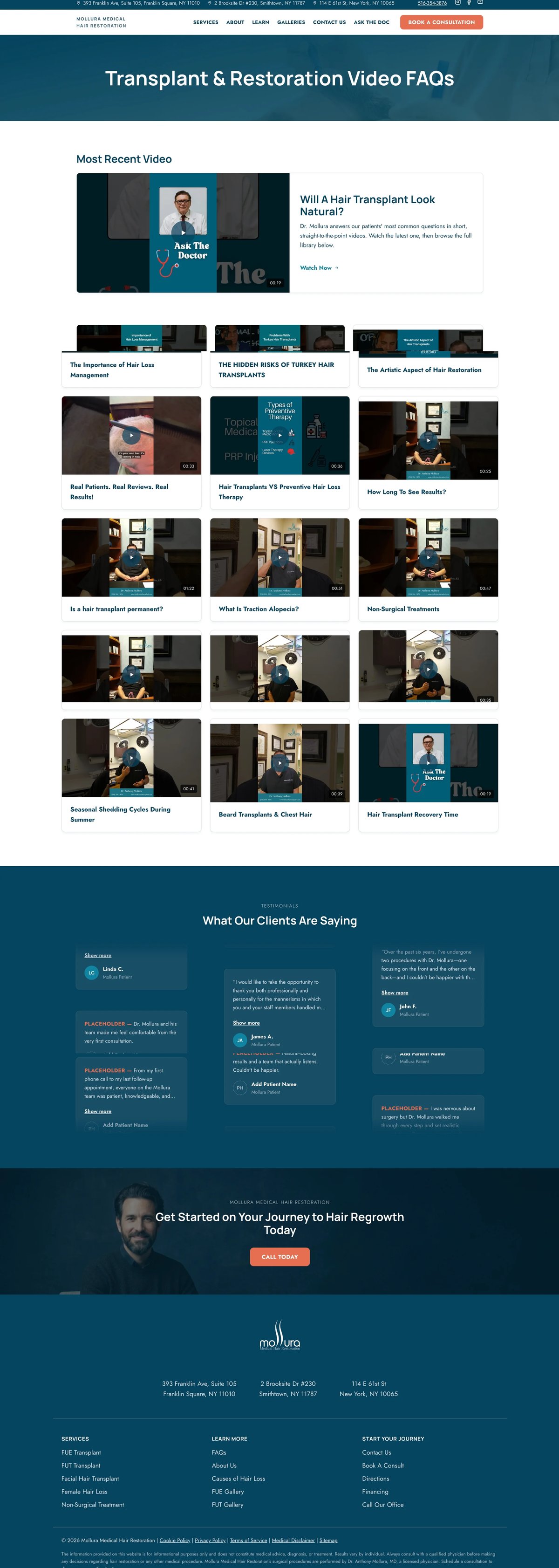
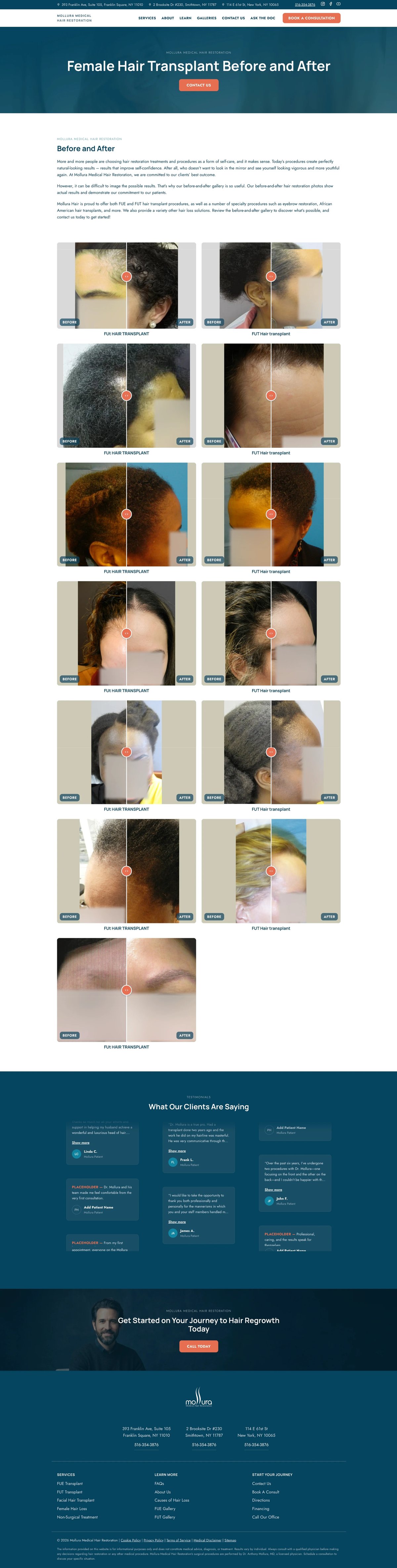
A short V2 brand guide came out of this redesign: Manrope for headings paired with Jost for body and UI text, a new coral accent for primary CTAs, and locked logo-usage rules so the mark never gets cropped or misapplied.

Full-color teal wordmark on white or light card backgrounds. This is how it runs across the whole homepage.

Reversed to all-white on dark grounds, like the navy footer band. The color mark disappears there.
Don't split the mark
The hair-strand glyph and "mollura" wordmark are one locked logotype file. Never crop the strands out as a standalone icon.
Pill buttons, fully rounded. Primary CTA now runs in coral instead of soft gray, for stronger contrast against both white sections and the dark hero image. Secondary stays an outline on dark grounds.
Voice & Tone"Start Restoring Your Hair Today!"Hero headline: direct, present-tense, leads with the outcome
"...the team at Mollura Medical Hair Restoration are waiting to hear from you."Contact intro: empathetic, speaks to the hesitation before the ask
"Seeing is believing."Before & after caption: confident, leads with proof over promises
This redesign is still in progress on staging. This case study will be updated again once it ships.